Comms manager Nick Brandum tells us how Fluid Design worked with Edge Case Games to make marketing creative for sci-fi multiplayer title Fractured Space
How we were introduced to Fractured Space and got the job.
I had recently started as comms manager for Fluid. As well as our general presentation to the world at large it is a big part of my job to hunt for the next brief. I had had some success in the past positioning ourselves in-front of startup agencies who may need support and whose clients may well need creative- so when I opened up MCV [Editor: who?] to find that Stefano Petrullo was setting up his own PR firm. I jumped on the phone and introduced him to Fluid. In kind, he introduced me to Edge Case Games - a client of his, who was about to launch Fractured Space- and we were promptly asked to pitch for the games key art and brand identity.
The Briefing:
Fractured Space gave both Edge Case Games and ourselves a tonne to work with creatively. The game itself is a detailed and nuanced experience and the studio has done an excellent job of engaging the community with social assets and other things that shed some light on the kind of art the fans and market wanted to see. A great example of this is a 'to scale' image demonstrating the vastness of the slavishly detailed ships compared to worldly landmarks like the statue of liberty- an image that, according to Edge Case, was one of the most heavily shared and commented on by their community.
We had a number of conversations like this; trying to lift the lid on the insight incubated by both great community engagement/management and a cogent vision for the game on Edge Case's part.
Getting to work.
As well as the nuggets of gold we could lift from the minds of the devs and community, we had at least two more filters to apply. Firstly, ‘what is the landscape of the market that this game is going into?’ This question is naturally an important one when entering a saturated space, of which practically all game genres represent, but none more so than a multiplayer space-battler.
Secondly, how could we take this as an opportunity to bring something fresh to the scene. That’s one thing about being a creative agency- we are a creative bunch and we want make things that are striking and unexpected - but that must be balanced with the rigour required to build effective marketing. Therefore, the challenge is to try and do something exciting but on brief.
The Process
Having discussed the evocative elements of the game, wrapped our heads around the vision coming from Edge Case and carrying out Stage One research regarding trends and competitors- we began to mood board.
The mood boarding stage is one of the most enjoyable stages of any project. There is a sense of unleashing our creative voyeurism and shamelessly scrapbooking designs and art that we think represent or contain ideas we could use- and these could come from literally anywhere.
After collecting oceans of reference imagery, we sift through for the strongest images to represent cogent concepts, suitable for the brief. These are then arranged into three style and tone mood boards, each representative of a potential creative route that could be developed into key art and ultimately- the full identity.
With Fractured Space, we knew what we were looking for. We wanted to do something that broke away from the monotony of inter-galactic-battlers dangling in a (very expected) black-void pack-shot. We also needed epic scale and pixel perfect detail of the most intricate kind.
As always, we pitched more than one way to achieve this ranging from the safe to the bold, the route that was actually chosen sat in between - which, again, is pretty typical.
Exploring routes/The Big Idea
We applied various treatments for Edge Case to consider and this makes an important point when it comes to key art as in all marketing- it has to be posited on a ‘big idea,’ which could be treated, executed or stylised in a number of ways. Styles, treatments and even compositions - in art - are easily confused with a big idea- but it’s a critical distinction. All of our work, whether it be campaigns or key art is built from an idea based on insight and strategy, which is then treated appropriately in the creative- we don’t think art styles first, just as a good social agency wouldn’t think technology first- content is king not the delivery system.
The big idea for this piece was to break the expectations for the genre in favour of a more lifestyle lead, minimalist approach that transmitted huge scale, drama and energy whilst achieving differentiation, namely on Steam.
In the pursuit of a style that fits this big idea perfectly, we explored a number of routes. We explored retro styles with high contrast and limited colour palettes, we explored silhouettes with strong shapes of in-game elements and even data graphics, taking inspiration from HUD systems and more.
We also explored a cinematic route, which leant itself in particular to demonstrating the scale of the ships by contrasting them against the astronauts beside them.
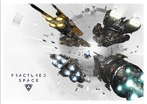
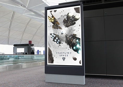
The Final Art
Having explored each of these, Steve Payne our art director (responsible for some seriously iconic work including LittleBigPlanet, Colin McRae, Alien Isolation and more) began to create what would become the final route. It was a hybridised approach, blending a filmic composition with lifestyle and retro accents.
The art held a limited palette with a white background and hight contrasts with a brutalist (almost lo-fi) interpretation of a wormhole that suited the art but stood out. Emphasis was on the ships and their immense scale (demonstrated through the use of smaller units in the peripheral scene) and their frenetic movement through the space fracture which was shown with the ships engine and thruster technology front and centre. Employing different colours for each thruster also made the scene richer whilst suggesting the variety of tech available in the game.
The process took us around three months, with the final ship models being rendered out by Edge Case Games. Edge Case was a dream client - transparent, forthcoming, responsive and helpful and we look forward to helping them out again should they need it.
In the meantime, Fluid is currently working on key art for unannounced titles, media kits for some hotly anticipated triple-A releases, making mad new retail creations for some of Hollywood’s hottest vault properties and preparing to march into the live music scene.
If you want to hear any more about our work, culture or approach- feel free to drop me a line. [email protected]